

CuesHub | Wearable Wellness Notifications
CONTEXT
CuesHub is a mental wellness app connected to a wearable, designed to detect early signals of burnout and intervene before users reach exhaustion using biosignal AI.
During my internship, I helped redesign the product from 0 → 1, focusing on recharge experiences and notification delivery for android users.
TEAM
1 CEO, 1 CTO, 4 digital marketers, 8 developers, 5 designers
ROLE
Product Designer
TIMELINE
Jun. - Sep. 2025
SKILLS/TOOLS
UX Research, UX Copy, Design Systems
OVERVIEW
The Problem
Early on, one question shaped the project...
If burnout builds quietly, how can CuesHub intervene without adding stress?
My task was to rethink CuesHub’s notification system, which ultimately shapes how and when users engage with the app.
CuesHub Terminology (for reference)
Mental Capacity: remaining mental stamina available.
Mental Effort: mental energy already expended.

USER RESEARCH
Listening Before Designing
We surveyed 30+ users and conducted 5 interviews with active CuesHub users to understand how people actually engage with wellness tools in moments of depletion, and gathered these insights:
Users want clarity, not suggestions 🪟
Users trusted feedback grounded in data over open-ended recommendations.
People act too late ⏰
Most users only reflect on burnout after they’re already exhausted.
Recharge looks different for everyone 🧘
The same activity could help one person but drain another.
Why Our Nudges Fell Flat
After reviewing the research, it became clear why our nudges failed. They assume users have the energy to stop, interpret a suggestion, and decide what to do next.
In reality, users nearing burnout have low energy, limited attention, and avoid making decisions.
Instead of asking users to decide,
“What should I do right now?”
we focused on helping them understand.
“What’s happening to my body right now?”
COMPETITIVE ANALYSIS
Learning From Other Wellness Apps
Before going straight into designing, I took a look at how popular wellness apps handle notifications.

While most apps allow users to customize alerts, they often fail to explain why a notification appears. Without that context, users are more likely to ignore or disable them.
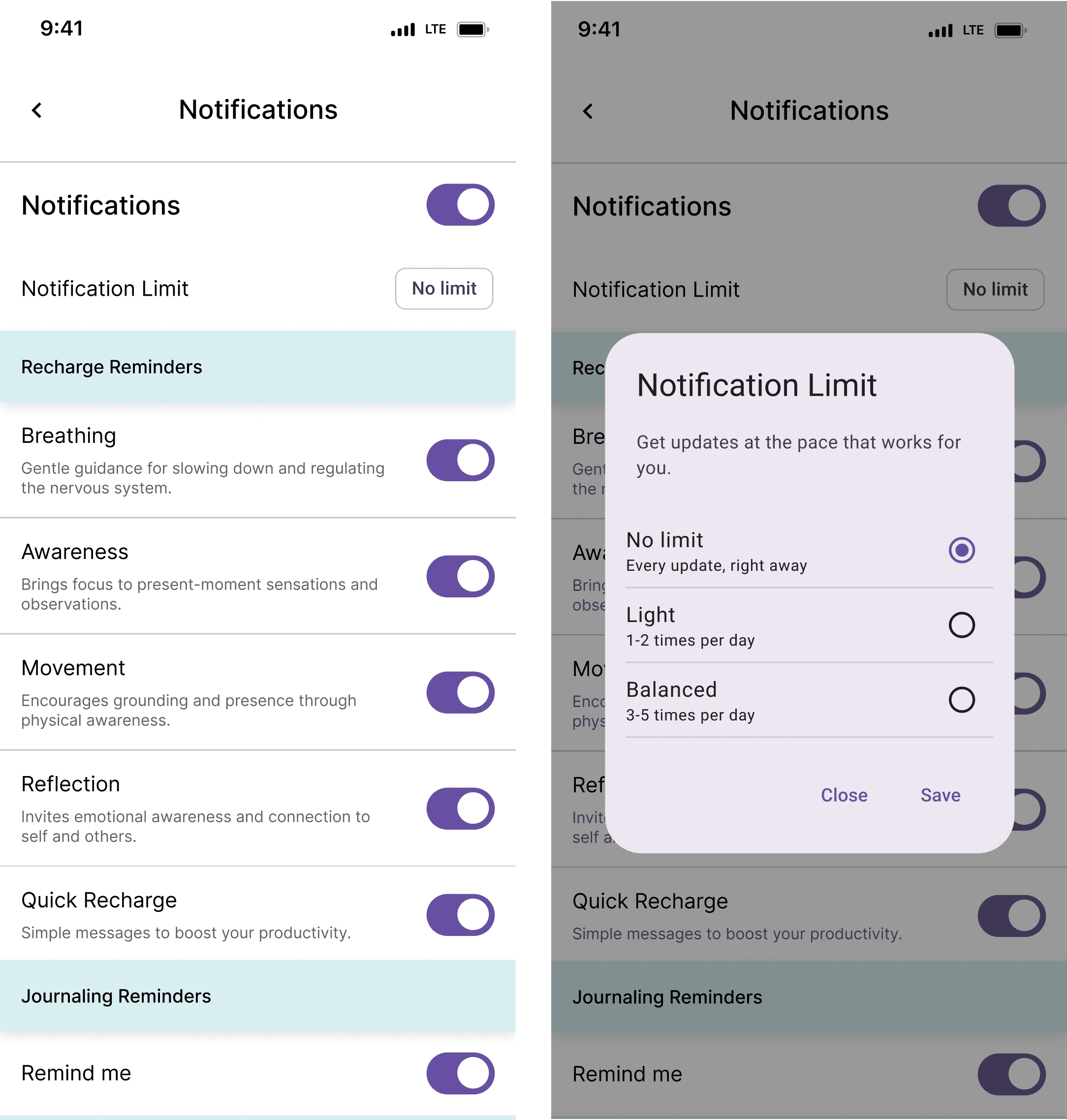
Designing the Notification System
I collaborated with developers and leadership to understand system constraints, including data collection and notification triggers. I defined notification types and timing upfront to prevent user overload.

Notification Triggers
Using the Material 3 Design Kit, I designed an interface for notification customization, with triggers handled in the backend.
Designing for Wearables
Once the notification system was defined, the next challenge was adapting it for Galaxy Watch.
First, I needed to familiarize myself with their design standards:

DESIGN ITERATIONS
Wearables demand fast, low-effort interactions with messages understood in seconds. I developed multiple UX copy iterations to achieve this:
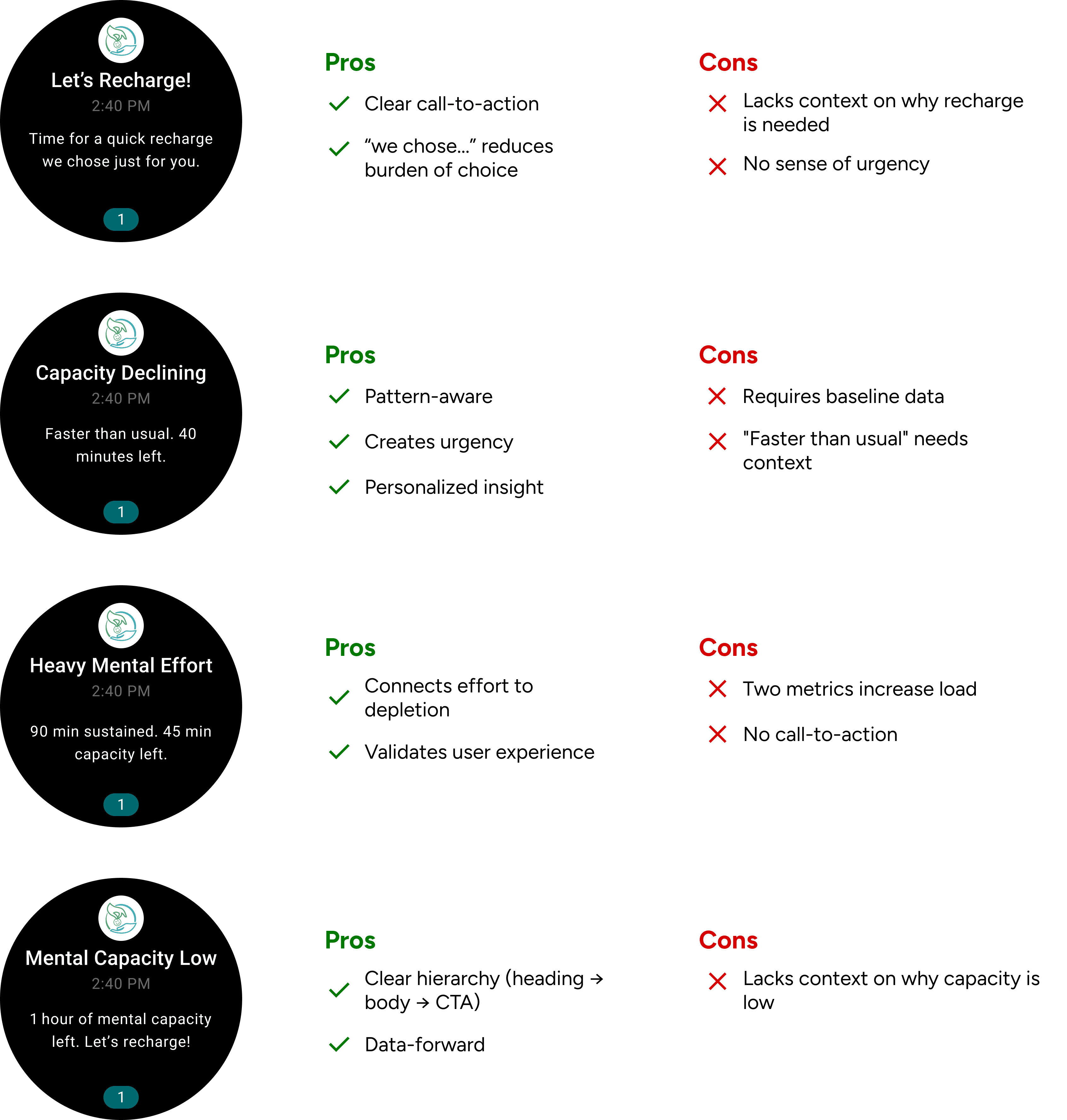
I selected the fourth iteration because it balances clarity with urgency. While it doesn't explain why capacity is low, users nearing burnout can't process complex information. By showing only time remaining and a clear action, we reduce cognitive load when users need it most.
In other words, the app handles the why, and the watch handles the now.

Building on this foundation, I created iterations for halfway and full mental capacity thresholds.


Haptic Feedback
Haptics further reduce cognitive load by letting users recognize alerts without visual confirmation.
Following Galaxy Watch guidelines, I designed short, distinct vibration patterns for each capacity threshold while avoiding extended or frequent vibrations that could annoy users or drain battery.
Standard Alerts
(gentle, 2 pulses)
Low Capacity Alerts
(medium, 3 pulses)
Critical Alerts
(firm, 2 short, pause, 2 short)
FINAL PROTOTYPE
[Potential] Next Steps
More User Testing
Validate notification clarity and haptic pattern recognition with 10-15 Galaxy Watch users over one week.
Threshold Optimization
A/B test trigger timings to find the optimal intervention point for engagement.
Contextual Enhancements
Explore adding contextual phrases for users who want more information without sacrificing wearable readability.
Long-Term Impact
Measure whether users develop proactive recharge habits, intervening at higher capacity thresholds over 30, 60, and 90 days.
Beyond the Interface
A 1.4-inch screen taught me more than I expected.
Less can be more.
This project taught me that the most impactful design decisions are often invisible. Choosing what not to include in a notification mattered more than perfecting visual polish.
Collaboration shapes constraints.
Working with eight developers, I learned to lead design conversations by understanding technical limitations first. This made my designs more feasible.
Constraints breed clarity.
Designing for Galaxy Watch's small screen and brief interactions forced me to prioritize ruthlessly. Every word and vibration had to justify its existence.